Lecture 8: Distributions
Normal distributions and the sampling distribution
In the previous lecture, we started talking about something called the standard error of the mean. We said that the standard error of the mean told us something about how spread out the sample means would be if we took multiple samples from the same population. That is, the standard error of the mean if the standard deviation of something called the sampling distribution. But before we can talk about the sampling distribution, we need to talk about distributions more generally, where they come from, and why they look the way that they do. That means that for now, we’ll put the standard error of the mean aside, but we will return to it later.
Up until now, we’ve skirted around the idea of distributions. We’ve looked at histograms of data, but we haven’t really talked much about their shape. It turns out that there are some shapes that we’ll come across very often, and some of these shapes have properties that will make them very useful for statistics. But before we can get to that, we need to first understand where these shapes come from—that is, why distributions have the shape they do—and some language for describing these shapes. We’ll start off with the simplest distribution, the binomial distribution, before moving on to the normal distribution.
The binomial distribution
To understand what the binomial distribution is, and where it comes from we’ll do a little thought experiment. In our thought experiment, we’ll take a coin, and we’ll flip it. When we flip a coin, one of two outcomes is possible. Either the coin will land showing heads, or it will land showing tails. We can say that there are two possible events or two possible sequences of events (sequences will make more sense when we add more coins) that can happen when we flip a coin.
But now let’s make it a little more complicated. Let’s flip two coins. Now there’s a greater number of possible sequences. We can list them:
- The first coin shows heads, and so does the second (HH),
- The first coin shows heads and the second shows tails (HT),
- The first coin shows tails and the second shows heads (TH),
- and the first coins shows tails and the second shows tails (TT)
Now there are four possible sequences. Let’s count up the number of sequences that lead to 0 heads, one head, two heads, etc. If we do this, we’ll see that one sequence leads to 0 heads (TT). Two sequences lead to 1 head (HT, and TH). And one sequence leads to 2 heads (HH).
Let’s now add more coins. Things will get trickier from here, because the number of sequences rapidly goes up. With three coins there will be 8 possible sequence. With four coins there will be 16 sequences. And with five coins there will be 32 possible sequences. To make things easier, we’ll draw a plot. First, we’ll draw out a plot to trace the sequences. We’ll use different coloured dots to indicate heads and tails. We can do this in the form of a branching tree diagram shown in Figure 1.
Once we’ve visualised the sequences, it’s easy to count up how many sequences result in 0 heads, one head, two heads etc. For this, we’ll make a frequency plot, or histogram, just like we’ve seen before. On the x-axis, we’ll have the number of heads. And on the y-axis, we’ll have the number of sequences that result in that number of heads. This frequency plot is shown in Figure 2.
Neither Figure 1 nor Figure 2 look very interesting at the moment. But that’s because we haven’t started flipping any coins. Move the slider above so that you can see what happens after we’ve flipped one coin, two coins, three coins etc.
Increasing the number of coin flips increases the number of possible sequences. And it changes the number of ways of getting one head, two heads, three heads and so on. Notice that as you adjust the slider and add more and more coin flips, the frequency plot takes on a characteristic shape. You can mathematically model the shape of this plot using a binomial distribution.
The binomial distribution is just an idealised representation of the process that generates sequences of heads and tails when we flip a coin. It tells us that if we flip a coin a certain number of times, and that coin lands head 50% of the time, then there is a particular number of sequences that will produce 0 heads, 1 head, 2 heads etc. And the shape of the distribution tells us how many sequences will produce each of those outcomes. We’ll encounter the binomial distribution again when we talk about probability, but for now hopefully the intuition make sense.
I said it’s an idealised representation, but we can also see that stereotypical shape being produced by natural processes. One natural process that gives rise to this shape is the “bean machine”. In a bean machine, small steel balls fall from the top of the device to the bottom of the device. On their way down, they bump into pegs. When one of the balls hits a peg, it has a roughly equal chance of bouncing off to the left or the right. At the bottom of the device are equally-spaced bins for collecting the balls. If enough balls are dropped into the device, then the distribution of balls across the bins will start to take on the shape of the binomial distribution. Very few balls will be at the far edges, because this would require the balls to bounce left or right every time. Instead, most of the balls will tend to be clumped somewhere near the middle. You can see an example of a “bean machine” in Figure 3.
Flipping coins might seem a long way off from anything you might want to study in psychology. However, the shape of the binomial distribution, might be something you’re more familiar with. This characteristic bell shape is also something we see in the normal distribution. And it’s the normal distribution which we’ll turn our attention to next.
The normal distribution
The normal distribution has a similar shape to the binomial distribution; however, there are a few key differences. First, the binomial distribution is bounded. One end represents 0 heads. And the other end represents all heads. That is, the distribution can only range from 0 to n (where n is the number of coins). The normal distribution, however, is unbounded. It can range from positive infinity to negative infinity. The second difference is that for the binomial distribution, the steps along the x-axis are discrete. You can have 0 heads, 1 head, 2 heads etc. But you can’t get 1.5 heads. But for the normal distribution, the steps are continuous.
The normal distribution is a mathematical abstraction, but we can use it as a model of real-life frequency distributions. That is, we can use it as a model of populations that are produced by certain kinds of natural processes. Because normal distributions are unbounded and continuous, nothing, in reality, is normally distributed. For example, it’s impossible to have infinity or negative infinity of anything. This is what is meant by an abstraction. But natural processes can give rise to frequency distributions that look a lot like normal distributions, which means that normal distributions can be used as a model of these processes. Before we talk more about the shape of the normal distribution, let us first examine some processes that give rise to normal distributions.
Processes that produce normal distributions
To see how a natural process can give rise to a normal distribution, let us play a board game! We won’t play it for real, but we’ll simulate it.
In this game, each player rolls the dice a certain number of times, and they move the number of spaces indicated by the dice. Not that dissimilar to what you’d do in a game of monopoly, or a similar board game! For example, if a player rolled the die three times, and they got 1, 4, 3, then they would move 8 (1 + 4 + 3 = 8) spaces along the board. At the end of one round of rolls we can take a look at how far from the start each player is. And we can draw a histogram of this data. You can explore the simulation in Explorable 1.
When you have enough players, and they play enough rounds, then the distribution shown in Figure 4 starts to take on the shape of a normal distribution. What is it about the dice game that gives rise to the normal distribution shape? In the dice game each players position is determined by adding up the value of each roll. This adding up is the key feature that determines the shape of the distribution of the players’ scores. Notice that this is also what we did with coin flips. We added up the number of heads. It doesn’t matter whether we’re adding up the number of heads or the outcomes of dice rolls. What matters is that each final value (number of heads or places from start) is determined by adding up numbers.
We can imagine other processes that might work similarly to the dice game. For example, a developmental process might work similarly. Let’s say that we have a developmental process like height. At each point in time some value (growth) can be added on to a person’s current height. That is, at each time point a person can grow by some amount just like each players’ score can increase by some amount with each dice roll. If you have enough people (players), and some time for growth to happen (rolls), then the distribution of height will start to look like a normal distribution.
Processes that don’t produce normal distributions
I’ve said that the key factor that gives rise to the normal distribution is that outcomes are determined by adding together numbers1. We can test out this idea by changing the rules of the dice game so that instead of adding together numbers we’ll multiply them.
In Explorable 2 we’ve changed the rules so that each players’ score is determined by multiplying together the values of their rolls. For example, under the new rules, if a player rolled 1, 4, 3 then their score would be 12 (1 × 4 × 3 = 12). Explore what happens to the shape of the distribution under these new rules.
In the new version of the dice game, the distribution of scores doesn’t look like a normal distribution. After only a few rounds you start seeing a few players with very high scores, but most of the players are clumped around near the start. You might notice that this plot looks a little bit like the plot we saw in Lecture 6 of the Average Annual Salary across a set of 79 countries. This is maybe not a total coincidence. Can you think of a process that might operate with similar rules as this game? How about interest, or returns on investments?
When you get a 10% annual return on an investment, and you start with £10, then after 1 year you’ll have 10 × 1.10 or £11. After two years, you’ll have (10 × 1.10) × 1.10 or £12.10.
Given this, it’s not surprising to see wealth distributions (whether across countries in the form of national salaries or within countries) to be heavily skewed in a manner resembling the outcomes of the dice game in Explorable 2. It’s simply a consequence of the rules of the game where wealth accumulates more wealth by multiplication! And in our dice game, this skewed distribution happens even though each player is rolling the same set of dice. A lucky few rolls at the start of the game and then some players get so far ahead that they’ll never get caught by the remaining players stuck down near the bottom.
In psychology, we won’t study many processes that grow like this, but it is an interesting exercise thinking about these processes.
Describing normal distributions
The normal distribution has a characteristic bell shape, but not all normal distributions are identical. They can vary in terms of where they’re centered and how spread out they are. We’ve already talked about measures of central tendency and measures of spread. In particular, we’ve talked about the mean and standard deviation, and these are what we use to describe the shape of the normal distribution.
The mean (\(\mu\)) determines where the centre is, and the standard deviation (\(\sigma\)) determines how spread out it is. Use Explorable 3 to explore the normal distribution.
We’ll come to this point later again, but I’ll mention it briefly here. One important thing to note is that when we make adjustments to the \(\mu\) and \(\sigma\) of the normal distribution, the relative position of points (in units of \(\sigma\)) doesn’t change, even though the absolute position of points on the plot do change.
But sometimes we see distributions that aren’t normal distributions. They’ve departed from this normal distribution shape in some way. There are specific terms for describing departures from the shape we see in the normal distribution. And it’s these terms that we turn our attention to next.
Describing departures from the normal distribution.
When we looked at the example of the game where a players score was based on multiplying together the dice rolls, it produced a distribution that was skewed.
Skew is actually a technical term that describes one way in which a distribution can deviate from the shape we see with normal distributions. The normal distribution is symmetrical, but a skew distribution is not. A left-skewed distribution has a longer left tail, and a right-skewed distribution has a longer right tail. Use Explorable 4 to explore skewness.
Apart from skew, deviations from the normal distribution can occur when a distribution either has fatter or skinnier tails than the normal distribution. The tailedness of a distribution is given by its kurtosis. The kurtosis of a distribution is often specified with reference to the normal distribution. In this case, what is being reported is excess kurtosis. A distribution with positive excess kurtosis has a higher kurtosis value than the normal distribution, and a distribution with negative excess kurtosis has a lower kurtosis value than the normal distribution.
Distributions with no excess kurtosis are called mesokurtic. Distributions with negative excess kurtosis are called platykurtic. And distributions with positive excess kurtosis are called leptokurtic.
In your research methods courses, you probably won’t come across many distributions that have negative excess kurtosis. However, the distribution that describes the outcomes of a single dice roll is one such distribution. You will encounter distributions with positive excess kurtosis more often. In particular, the t-distribution, a distribution with positive excess kurtosis, will be used in several of the statistical procedures that you will learn about next year. You can use Explorable 5 to explore excess kurtosis.
Distributions and samples
Now that we’ve talked a little bit about samples and populations (in Lecture 6 and Lecture 7) and we’ve also covered distributions, we’re going to start putting these ideas together. We’ve seen that whenever we look at the distribution of values where the values are produced by adding up numbers we got something that looked like a normal distribution.
When we covered the sample mean in Lecture 6, the formula was as shown in Equation 1, below:
\[\bar{x}=\frac{\displaystyle\sum^{N}_{i=1}{x_i}}{N} \tag{1}\]
This formula can be re-written as shown in Equation 2, below:
\[\bar{x}={\displaystyle\sum^{N}_{i=1}{\frac{x_i}{N}}} \tag{2}\]
What Equation 2 makes clear is that calculating a mean is just adding up numbers. Now let’s think about taking lots of samples from a population. And for each sample, we calculate the sample mean. If we had to plot these sample means, then what would the distribution look like? We can try it out. Let’s say that I have a population with a mean of 100 and a standard deviation of 15. From this population I can draw samples. Let’s say that each sample will be 25 values (that is, the sample size will be 25). After I’ve collected my sample I’ll work out the sample mean, and I’ll do this 100,000 times and plot the results. You can see this plot in Figure 5.
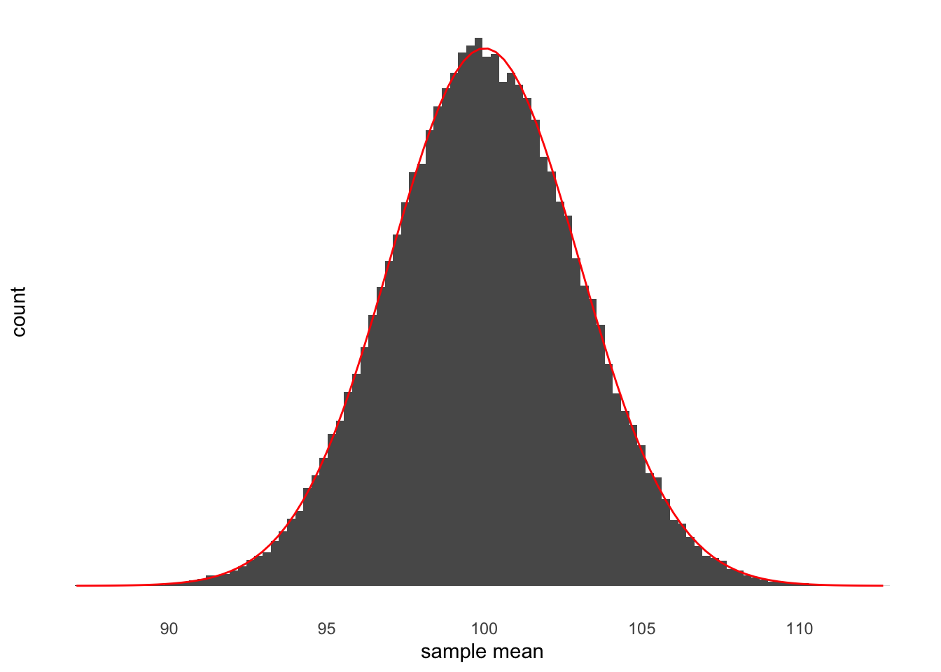
As you can see in Figure 5 the distribution of sample means is shaped just like a normal distribution. This is exactly what you’d expect. To make it clear that it’s shaped like a normal distribution, in red I’ve drawn the outline of a normal distribution. This normal distribution has a mean of 100, which is just what the mean of our population is. It also has a standard deviation of 3. This distribution is an example of the sampling distribution of the mean. This means that the standard deviation of this distribution is the standard error of the mean because the standard error of the mean is just the standard deviation of the sampling distribution of the mean.
The central limit theorem
Before we get to how we work out the standard error of the mean I just want to assure you of something. You might think that in the example above the sampling distribution of the mean has a normal distribution because we’re drawing samples from a population that has a normal distribution. That is, you might think that because the parent distribution has a normal distribution, the sampling distribution will have a normal distribution.
But this is not the case. As long as we’re dealing with the sampling distribution of the mean (that is, a value we calculate by adding up numbers) then we’ll see a sampling distribution that has the shape of a normal distribution. You can explore this fact in Explorable 6
The standard error of the mean
In Lecture 7 we started talking about the spread of sample means around the population mean that occurs when we repeatedly draw samples from the same population. I showed you an example where the average deviation was small (that is, on average the individual sample means were close to the population mean). And I showed you an example where the average deviation was larger (that is, on average the individual sample means were further away from the population mean). We also learned in Lecture 7 that variance is a measure of average (squared) deviation.
I ended the lecture by asking you to think of two situations where the average deviation (of sample means around the population mean) would be small or 0. If you managed to think of those two situations, then great! But if you didn’t, then here they are:
First, a feature of populations that will make the average deviation of sample means around the population mean be equal to 0. If the variance in the population is 0 then all sample means will be identical to the population mean. Why? Because if the variance in the population is 0 then all members of the population will be identical. The typical value (the mean) any sample will have to be identical to the population mean, because there’s only one value anything can take.
Second, a feature of the samples that will make the average deviation of samples means around the population mean be equal to 0. If the sample size is so large that it includes the entire population then the sample mean would, by definition, be equal to the population mean. So if all your samples are this large then all the sample means will be equal to the population mean. And this means that the average deviation of sample means around the population would be equal to 0.
This means that if we want to compute the average (squared) deviation of sample means around the population mean then it will depend on two factors. First, when the variance of the population (\(\sigma^2\)) is small then the variance of sample means around the population mean will be small. Conversely, when the variance of the population is larger then we’d expect the variance of sample means around the population mean to be larger. Second, if the sample size (n) is large then the variance of the sample means around the population mean will be small. Conversely, when the sample is small then we’d expect the variance of sample means around the population mean to be larger.
The only way to combine \(\sigma^2\) and \(n\) that matches these observations is as shown in Equation 3, below:
\[\frac{\sigma^2}{n} \tag{3}\]
This formula gives us the variance of the sample means around the population mean. But I said that the standard error of the mean is the standard deviation of the sample means around the population mean. That means that we just need to take the square root of the formula in Equation 3. And because we don’t actually know the value of \(\sigma\) (the variance of the population) and only know our estimate of it, the sample variance (s), we need to replace \(\sigma\) with s. This gives us the equation in Equation 4, below:
\[\frac{s}{\sqrt{n}} \tag{4}\]
This is exactly the formula for the standard error of the mean.
Now this is, admittedly, a fairly long winded way to get to what is essentially a very simple formula. However, as I have alluded to several times, the standard error of the mean is a fairly misunderstood concept. Part of the reason for this is that it’s often just presented as a formula. I hope that getting there the long way has helped you to build a better intuition of what the standard error of the mean actually is.
Check your understanding
Use this quiz to make sure that you’ve understood the key concepts.
Leave a comment
If you’d like to leave a comment or ask a question about this week’s lecture then you can use the comment box below. Note that comments will be accessible to the lecturer but won’t be displayed until they have been approved.
Footnotes
Or subtracting, because subtracting is just adding negative numbers↩︎
Note that the sampling distribution and the normal distribution shown in the plot won’t always match perfectly even when the sample size is large. This is because the normal distribution is an idealisation of what happens if you collect an infinite number of samples. But we’re not collecting an infinite number. We’re only collecting 50,000↩︎